Highlight Section
- Mobile-friendly websites help businesses rank higher on Google
- Fast websites keep visitors happy and engaged
- Responsive design builds trust and improves sales
- Good design works on phones, tablets, and desktops
- Smart businesses invest in responsive websites for long-term growth
Introduction
In today’s digital world, having a website that works smoothly on every device is no longer optional. Businesses need smart responsive web design strategies to ensure their websites look great, load fast, and perform well across all screen sizes, including mobile phones, tablets, laptops, and desktops. Many business owners want websites that not only look professional but also rank higher on search engines, bring more traffic, and encourage visitors to take action. A poorly designed website can lead to slow loading times, high bounce rates, and lost customers.
In 2026, users expect a seamless experience no matter what device they are using. If a website does not adjust properly to different screen sizes, users are likely to leave and choose a competitor instead.
This guide explains why responsive design is important, how it improves user experience and SEO, and how it helps your business grow in a competitive online market.
Why Are Responsive Web Design Strategies Important in 2026?
In 2026, websites are no longer viewed only on desktop computers. People browse, shop, compare services, and make decisions using multiple devices throughout the day. That is why every modern business needs strong responsive web design strategies to deliver a smooth and consistent experience for all users.
A responsive website automatically adjusts its layout, images, text, and navigation based on the screen size. This ensures that every visitor—whether on a phone, tablet, or desktop—can easily use the website without zooming, scrolling issues, or broken layouts. A well-optimized website also improves engagement on platforms like Google Chrome, where users expect fast and seamless browsing experiences. Main reasons:
- Better mobile experience – Responsive websites make it easy for mobile users to browse, read content, and take action without frustration.
- Higher Google rankings – Search engines prefer mobile-friendly websites, which helps improve SEO performance and visibility.
- Faster page loading – Optimized layouts and images improve loading speed, reducing bounce rates and keeping users engaged.
- More customer trust – A clean and professional design builds confidence and makes your business look more reliable.
- Better lead generation – Easy navigation and clear calls-to-action help convert visitors into inquiries or customers.
- More sales opportunities – A smooth user experience increases the chances of users completing purchases or bookings.
These benefits show why responsive web design strategies are essential for modern businesses that want to stay competitive, improve performance, and grow online successfully.
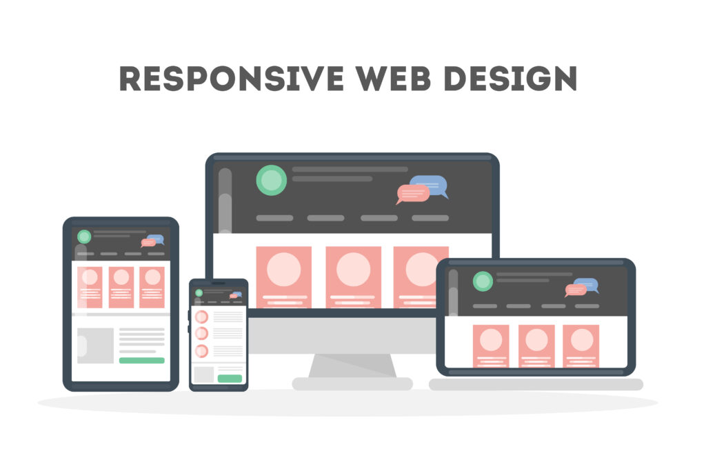
What Is Responsive Web Design?
Responsive web design is a method of building websites that automatically adjust to fit different screen sizes and devices. Instead of creating separate versions of a website for mobile and desktop, a responsive website adapts its layout, images, text, and structure based on the device being used. This ensures that every visitor gets a smooth and consistent experience, no matter how they access the site.
Modern websites must perform well across multiple devices, including smartphones, tablets, laptops, desktop computers, and other smart devices like smart TVs. A responsive website removes usability issues such as zooming, horizontal scrolling, or broken layouts, making it easier for users to navigate and interact with content.
What Are the Best Responsive Web Design Strategies?
A successful responsive website is not created by chance. It is built using proven design principles that focus on user experience, performance, and accessibility.
When businesses apply strong responsive web design strategies, they create websites that are easy to use, fast to load, and visually consistent across all devices. Good design always starts with understanding user needs and behaviour. Important strategies:
- Mobile-first design – Designing the website for mobile devices first ensures better performance and usability on smaller screens.
- Flexible layouts – Using fluid grids and adaptable layouts allows content to automatically adjust to different screen sizes.
- Clear navigation – Simple menus and structured navigation help users find information quickly without confusion.
- Touch-friendly buttons – Buttons and interactive elements should be easy to tap on mobile devices without errors.
- Fast-loading images – Optimized images improve website speed and reduce loading time on all devices.
- Easy-to-read text – Proper font size, spacing, and contrast improve readability across screens.
These proven techniques form the foundation of effective responsive web design and help businesses create websites that deliver a better user experience, improve engagement, and support long-term growth.
What Are the Best Responsive Website Optimization Tips?
This section explains practical ways to improve website performance using simple optimization methods. Even small improvements in website design and structure can significantly boost speed, usability, and customer satisfaction. A well-optimized responsive website ensures users have a smooth experience on all devices, which directly improves engagement and conversions.
When businesses apply strong responsive web design strategies, they often see better performance, lower bounce rates, and improved SEO results.
Easy optimization tips:
- Compress images – Reduce image file sizes without losing quality to improve page loading speed.
- Remove unused code – Clean up unnecessary scripts and CSS to make the website lighter and faster.
- Use clear fonts – Choose readable fonts that improve visibility on all screen sizes.
- Reduce page clutter – Keep layouts simple so users can focus on important content and actions.
- Improve menu design – Create simple navigation menus that are easy to use on both mobile and desktop.
- Test every device – Regularly check how your website performs on smartphones, tablets, and desktops.
These small but powerful steps help improve both speed and user experience, which are key factors for modern website success.
Should You Hire Responsive Web Designers?
Creating a fully responsive website requires technical knowledge, design skills, and experience in user behavior. Professional designers help businesses avoid common mistakes and build websites that perform well across all devices. When you work with experts, you get a website that is not only visually appealing but also optimized for performance, SEO, and conversions. Designers help with:
- Mobile layouts – Creating designs that work perfectly on small screens.
- Speed improvements – Optimizing images, code, and structure for faster performance.
- Better user flow – Designing smooth navigation paths that guide users toward action.
- SEO-friendly design – Structuring websites to support better search engine visibility.
- Device testing – Ensuring the website works properly on all screen sizes and browsers.
Hiring experts saves time, reduces errors, and improves overall website quality.
What Do Responsive Web Design Services Include?
Web design services provide end-to-end solutions that help businesses build, optimize, and maintain modern websites that perform well on all devices. These services ensure that websites are not only attractive but also functional, fast, and user-friendly. Services include:
- Website planning – Understanding business goals, audience needs, and site structure.
- Custom design – Creating unique layouts tailored to the brand identity.
- Mobile optimization – Ensuring the website works smoothly on smartphones and tablets.
- Speed testing – Improving performance and reducing load times.
- SEO setup – Structuring the website for better search engine visibility.
- Ongoing support – Regular updates, fixes, and performance improvements.
These services help businesses maintain a strong and competitive online presence.
Tips to Improve Responsive Website Performance
Regular monitoring and updates help keep your website fast, functional, and user-friendly over time. Smart tips:
- Test your website each month
- Check loading speed regularly
- Update and compress images
- Review mobile and tablet layouts
- Simplify content structure
- Monitor user behavior analytics
- Fix broken layouts quickly
These ongoing improvements support strong responsive website optimization tips and ensure consistent performance.
FAQs
Why are responsive web design strategies important?
They ensure websites work smoothly on all devices, improve user experience, and help businesses reach more customers effectively.
What is responsive web design?
Responsive web design is a method of building websites that automatically adjust to fit different screen sizes, including mobile phones, tablets, and desktops.
What are the best responsive web design strategies?
The best strategies include mobile-first design, flexible layouts, clear navigation, fast loading pages, and touch-friendly interfaces.
Should I hire responsive web designers?
Yes, hiring experts helps you avoid design errors, improve performance, and create a website that works well across all devices.
Does Shopify responsive website design help ecommerce stores?
Yes, a responsive ecommerce store built on Shopify improves mobile shopping experience, increases conversions, and often leads to higher sales.
Conclusion
A strong website must load fast, fit every screen, and help visitors take action with ease. That is why smart businesses invest in responsive web design techniques, strong mobile layouts, and better user experience. When you follow responsive website optimization tips, use expert responsive web design services, and work with professionals who understand mobile-first design, your website can rank higher and convert more visitors.
Whether you run a business website or a store on Shopify, strong responsive web design strategies can support long-term digital growth and business success.